My first 3D crane was a lab in 3D class. This one is my own animation. Our professor, Gavin provided the specs to design this particular model crane. 3Ds Max supplied the bitmaps.

Friday, December 17, 2010
Wednesday, December 8, 2010
Don't Attempt The Following At Home
This was actually the first assigned project in Video this semester. Unfortunately the Fire Store we were using to record our footage had some issues and we were unable to secure the green room again, so this video remained unfinished. I took a minute tonight to finally throw together a quick, fun mess of adventure. Don't try this at home. Unless you have your own green screen.
p.s. I thought my grammar sounded fine while exporting the final video, but might need to adjust a line (in the end credits).
It was filmed in HD, but is compressed for this blog.
Sunday, December 5, 2010
Pecha Kucha
I've decided it's okay to have no certainty in the exact pronunciation of Pecha Kucha, because when I look it up, I see three pronunciations and several people sure that they are right. It seems obvious that the Japanese way of saying it would differ from the English, so I'll presume (PETCH-ah KOO-cha) is English and will probably become the common way it is said in our accent. The three that I hear touted as the actual pronunciation are (p'KAh k'CHAh ), (p'CHAh k'CHAh ) and the third and somehow obviously just wrong as though someone heard the real thing and tried to sound as though they were saying it correctly (puh-CHAWCH-ka).
I'll be saying (p'KAh k'CHAh). If that pronunciation guide is confusing, think of a chicken sound... I'd write it: " b'GAh! "
...but you can't hear me for now anyways, so let's move on.
Tying everything to either media or conceptions about psychopaths, true or false, I decided still to examine psychopathy as mental illness, Hare's research, empathy, movies and television, behavioural indicators and the subclinical psychopath (including white-collar psychopathy), the idea of childhood psychopathy and the potential for treatment of psychopathy.
I also created a loose frame to structure my research, but will allow for it to be merely a guide not written in stone. My frame sets a direction by predetermining a possible slide series for my 20 images.
1-Intro
2-What people tend to think of psychopathy
3-Movies and television
4-News Media
5-Mental Illness
6-Hare
7-PCL and behaviour
8-Serial Killers
9-White Collar
10-Next Door
11-Prevalence
12-Prison
13-Therapy
14-Biology
15-Will Power
16-Emotions
17-Children
18-Prejudice
19-Rights
20-Conclusion
Thursday, December 2, 2010
Don't Stare
Just a quick little render of the Sun I created for a 15 second animation I'm working on in 3Ds Max
Thursday, November 25, 2010
What Is Love?
Our recent 3D assignment was to animate any object to give it human characteristics. I decided buildings would perhaps be an overlooked inanimate object. I don't know why I decided to make them dance, but once the decision to do that was made, it didn't take long for me to think of the humour of parodying SNL.
Tuesday, November 16, 2010
Thursday, November 11, 2010
Part of This Balanced Breakfast...
Just some more personification to the box of cereal...
"Chased By a Cereal Killer..."
"Chased By a Cereal Killer..."
Tuesday, November 9, 2010
To The Death
Our most recent VideoII class had us take footage our teacher supplied, then add a knife and a touch of gore... I didn't have the blood land on the floor, but you get the idea.
Monday, November 8, 2010
The Creative Mind
Since my skatedeck, I haven't had much of a creative series showing the process of my work. But I've got a new assignment that both seems and is appropriate, and is able to hold to the creative challenge that I'm sure for set myself...
I wouldn't have guessed that the particular course it comes from would ever have an assignment posted here on my creative blog. Now, it does require our posting the process to a blog, but I really find the idea exciting enough (and artistic enough) that I'd have posted it all here anyways.
Watch this video, which was my introduction to the medium that this creation shall be. I'd never heard of it before, but it got me somewhat excited to put one together.
And I'll let you know shortly, what area of criminal psychology I'll be studying for it.
Thursday, November 4, 2010
Saturday, October 23, 2010
Space... The final -attempt?
Alright, so this will be the third time I've written a variation of this article. I gave up on rendering my logo animation in 3ds, because I'm a Mac owner and have no Windows. What I did was render a series of jpegs and then used Flash (who says it's dead?) to finish my animation in...oh, one one-millionth of the time it might have taken max.
It occurred to me that I might have given Max quite the task, asking it to try to render a transparent, colourless object fade in form zero opacity to one-hundred while fading from that to full coloured stone, slate and marble ...
Am I cheating? My thoughts were as such: What if I render it at one fram per 3-6 hours and need to make a change? Yes max can 'simulate the animation, but what if the actual animation is dissatisfying? What if the only reason I'm waiting so long is because lighting is being considered over 20 frames of visibility channel, whereas Flash can just do it right away as a tween? My objective in this case was conclusion. The art is in creation, not software. I created. The software was calculating for every frame as though it couldn't consider the one before. The act of my creation was satisfied. It truly was a matter of program from that point.
Thursday, October 21, 2010
Soon.

I spend the better part of my afternoon watching 3DsMax fail to render my logo animation. Actually one third of a frame of it. It's 180 frames long and the school actually closes in 3.75 hours, so I've decided it's no longer worth my wait just to have to quit then anyways. But, in the mean time, here is the jpeg of the final frame. It seems just a little cooler now than my previous posts.
Thursday, October 7, 2010
Recoloured
I made the logo colour a little more true, but still kept some artistic liberty due to the materials I chose. I also gave the source image.


A Return To My Nerdedness
Yes, I did say nerdedness, rather than the more cliché nerdiness. And this won't be the last time.
When asked to recreate any logo of our chosing in 3Ds Max, I wanted to recreate something with a lot more detail than say, the FedEx logo (clever as it is with its arrow in the negative space). Simple logo design didn't seem to hold the portfolio appeal as doing one that was a little more complicated. Any difficulties I ran into only furthered my knowledge of the software.
Not one for selecting some random logo that I have no care for, I turned to my interests. I was going to do the album cover of the A Perfect Circle Album, "Mer De Noms." The reason I did not was because really, the logo itself was simple, and I could not find the true font (despite use of Identifont and What The Font). Tracing the letters proved to be conducive of error due to the poor resolution of the image.
So, without further wear on this keyboard, I give you the 3D rendering of the logo for The Romulan Empire (as seen in the ST:TNG era).

Thursday, September 23, 2010
3D NHL Logo

Nothing too over the top, just the results of a lesson. I will be creating a logo of my choice as an assignment in the comming week.
Thursday, September 9, 2010
First 3D Studio Max Image
So this marks my first entry for third semester in Digital Media Arts. In my first Intro to 3D class, I created this snowman. I'm very much not forgetting to be politically correct; obviously, he's a snow-person. This individual happens to be male. His mother was a snwoman.

Friday, August 20, 2010
Infinitesima
There's a chance you came to this blog through infinitesima anyways, but incase you were just following along with the journal here (I hate the word blog), my portfolio site is up. I'll be perfecting the flash intro soon, as it doesn't align perfectly, but until then, it still works. See my site at:
http://infinitesima.net
Infinitesima (in-fin-it-ES-im-a) is derived from the word infinitesimal, meaning infinitely small.
I first pondered the concept of an infinitely small positive number back in highschool when a math teacher brought up the idea of moving half way to something, then half way again, and so on...
Thursday, August 19, 2010
Pet-Peeve
Is it weird that it bothers me when people say monochromatic when referring to grayscale images? Since when does "one colour" mean "no colour?" The word for that is "achromatic." Thanks.
Tuesday, August 17, 2010
Mesozoic Tales


There's a chance, I might have done more than necessary in this final assignment of DMA234 (aka computer graphics and imaging). We had to come up with a story board for a banner for a microsite dedicated to our skateboard deck from first semester (mine was titled "Mesozoic").
What I did that I've heard was not required, is the landing page as well as main microsite mockup.
http://infinitesima.net/DMA234/mesozoic/mesozoic_mp.html
...Also, for the cover, rather than "Terror" or "Horror" or the name of a registered comics publication company name, I thought "Mesozoic Press" would be reasonable and sound somewhat dated as a comics company name. It was too long however, so I initialed Mesozoic, and went with MPRESS, which I think was somehow more clever, lending to the possibility that I might have meant impress or empress.
...Also, for the cover, rather than "Terror" or "Horror" or the name of a registered comics publication company name, I thought "Mesozoic Press" would be reasonable and sound somewhat dated as a comics company name. It was too long however, so I initialed Mesozoic, and went with MPRESS, which I think was somehow more clever, lending to the possibility that I might have meant impress or empress.
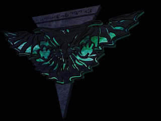
Holy feathers and scales, Batman...
*note: I used exclamation marks stylistically. I otherwise avoid using them almost entirely. I believe it was F. Scott Fitzgerald (though it is often attributed to Mark Twain) who once said "Cut out all these exclamation points. An exclamation point is like laughing at your own joke."
"The Horror... The Horror..."


My ideation came immediately while researching rockabilly and psychobilly poster design. Although I have come across imagery that remind me of Grindhouse style movie posters (and I would love to create one of those sometime soon), I was most compelled to create a horror comic book concept for my final project in DMA234.
I already had a style guide and skateboard from last semester to work with, as well as all of the individual elements I created for it; each basic element on that skate-deck not only has its own layer in the final file, but I actually still have dedicated files for each of them, so reuse was no problem at all. I shall save the posting of redundant imagery and simply refer to the assets I've reused.
The Carnotaurus sketch from my original ideation of the deck made its way to photoshop for some colouring. I left the light pencil detail to give it a gritty look.
The feather was a vector trace from a real fossil that I copied over (as there was only one authentic image I could find and it was quite a trace job, if I may say)
The lady screaming is taken from part of an image I drew of an actual woman from a life-drawing class I attended. I was amazed at how cool she looked once coloured with the scream text behind her. The original image scan quality was quite low, so I traced it again as my first layer.
I used inspiration from a common horror comic cover 'template' most recognizably used by "Tales From The Crypt." Also, I found a random horror comic page to use for framing.
Rather than use the seal of the Comics Code Authority, or what ever branch was labeled on these comics, I gave my own Infinitesima seal, and lowered the saturation.
Friday, August 13, 2010
Infinitesima
So, you might have noticed my personalized branding change, with a new logo. This is because I'm in the process of coding my website as we speak, and this blog will be linked from there. So my blog is your sneak peak to the site itself.
Tuesday, August 3, 2010
HDR


My first HDR shots. In Digital Photography, we were given an assignment to shoot 30-40 shots in 30mins. I converted these images to HDR just for fun. The cloud over Seneca is my obvious favourite
Sunday, August 1, 2010


Friday, July 16, 2010
Rickard's v.04

For this revision of my Rickard's website, I was asked to include more content, copy/info, people and though my shadow concept was good, the dark room image had to be changed; for the purpose of my initial mockup, I used a picture of a wall, as a stand-in, that I had found on Google. I kept that concept for my Rickard's Dark ad, but recreated the concept with my own photo and added a Rickard's Dark glory shot. I found a high-quality stock photo of a pint of beer, but had to photoshop it to make it look like Rickards Red.
Wednesday, July 14, 2010
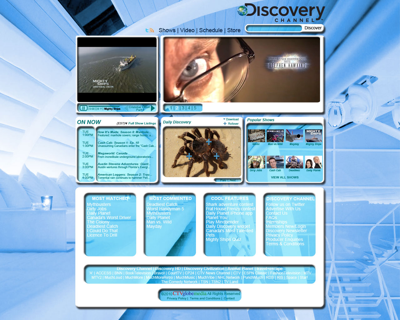
Discovery Channel v.02

For my reworking of my Discovery Channel concept, first, I dropped the emboss and hard drop shadows, then moved the logo to the left. I noticed my frames were not quite uniform or properly balanced, so I recreated them and moved around the middle ones. While attempting to make the image a little less soft, I determined that the background image was no longer complimentary to the layout, so I found a new, more appropriate one. I personally feel the second version stands out far better than the original.
I should also note that the image is cropped for this blog.
Sunday, July 11, 2010
Kensington Market Book for Digital Photography


Our class went on a field trip to Kensington Market a tour guided by our Professor, Michael Visser. We were asked to narrow our images down to produce a book with 6 pages, not including the front and back cover. We needed to create or own captions and theme. My book was composed of 8.5 x 11 sheets folded to 8.5 x 5.5 with staple bindings. I also stapled my pages together, somewhat at random (but not really into the images) to match my theme and just so the book was made, in essence, from double-sided prints. Also, I opted for more pages.
I've cropped the jpegs from my photoshop files for the purposes of this blog, so that it reads cover to cover, from top to bottom.
Tuesday, July 6, 2010
24...


No, not more Rickard's. Jack Bauer has lost his cell phone somewhere or the internet. There goes about half the show's dialogue. It's probably dead anyways, he doesn't really charge it or have a spare battery.
Banners for DMA234
Monday, July 5, 2010
Granted it's not much...


I have been making a flash animation for a few hours today in a banner size of 300 x 250px. I decided to just mix backgrounds I created in illustrator with some photos I sampled from Google.
I had a background I had already shown (top) that I wanted to show again from further away, but it was barely cropped to fit my frame to begin with. I did some pretty simple photoshopping to place it into another background. The product is the lower of the three images. I know it's not perfect, but it's only seen for about one twentieth of the animation.
Wednesday, June 30, 2010
Rickard's v.01

I'll not get into my personal history with Rickard's, haha. I kept with slightly larger backgrounds than we were optimizing for in each of these concepts.
I personally prefer this Dark concept to the Red or White.
I should note that I did not create the image of the wall itself, but otherwise the concept is mine.


Tuesday, June 29, 2010
Discovery Channel v.01
In the layout portion of DMA500 (web-design) we had to create a mockup for two different and established brands. One was required to be a big background website and the other could be if we liked. I decided Discovery Channel deserved a new (innovative?) look with a big background. I was thinking more futuristic in theme because that's the direction of exploration. My very first time watching the channel in the mid 90's played a part; the first two shows I ever watched on the channel were about futuristic homes and futuristic RVs.

Friday, June 25, 2010
Finally.. Goodride
What? You've never heard of loctions before? A loction is a common way to incorrectly spell the word "locations." Anyways, I've corrected the spelling on my website.
The concept I formulated for this is to have the tire class selection in the bottom right. All of the available tires for a class would roll onto that stage from the right. When you select the image of one of the available tires, it would roll to the bottom left panel, where the information would essentially 'catch' the tire.


Friday, June 18, 2010
Thursday, June 17, 2010
Synesthesia


Our final typography assignment of the first half of the semester was to create three images using text as a design element. This assignment allowed for much more abstract work, and as I have just completed a course in abnormal psychology, I decided to look for obscure psychological conditions.
Synesthesia is not considered a disorder on the DSM, as it is not a hinderance - in fact many consider it a gift. It's funny to note that I once asked my psychology professor about a peculiar sensation I would experience during heightened inspiration - a taste - and she suggested synesthesia as a possibility, but any number of brain functions may cause it. At the time, I didn't know what synesthesia was, and forgot to look it up. I find it ironic that it would come full circle, when I unwittingly did the research, but for an art project.
I created two variations of the image emphasizing the pronunciation, the top one being an unofficial entry because I completed it after having committed the lower three to print.
I would like to create another piece in this series, if possible as an achromatic work.
And, if I may be so bold, the final piece shown (which was the first one I did) tasted best.
*Interesting fact: Most notably in the official image emphasizing pronunciation (The dark one), all of the 'A's are red. Red is the colour associated most with the letter A by those with grapheme-colour synesthesia (the type when letters and numbers are associated with colours). Some theorists believe that this is due to the fact that red is the first colour humans can perceive during development, and the letter A is the first letter most of us learned growing up.
Subscribe to:
Posts (Atom)