As I work on the relaunch of Perspectra, I've decided to update its brand, and give it a cleaner, more sophisticated feeling. Not only that, but having combined the words "perspective" and "spectra" had a meaning I wanted to convey without making prospective clients pull it apart on their own, plus I just like the idea of my clients getting the work they want to buy, not only what I love to shoot, so my updated tagline reflects that better, and I've decided to almost always place it with my logo.
The website is mostly functional... a kind of bootstrapped site that is live and under construction at the time of this post
www.perspectra.ca
Wednesday, April 19, 2017
Diamond Dogs
I've been working full time, and putting a lot of effort into my photography business, Perspectra, but that's really no excuse to not update my blog with my love of design. Most recently, I vector traced a simple logo for my brother's baseball team. He (Josh Hopkins) designed it.
Monday, September 23, 2013
The A-10 Warthogs
You know you're a design nerd when you whip up a logo for your fantasy hockey league team, when the ESPN site will never show this logo in full size anyway.
ESPN size:
Variant 1:
Tuesday, August 6, 2013
Rechromatic III
While researching old damaged photo restoration, I came across some great work by others, and felt the need to test myself. I also wanted to incorporate some of the colourization techniques I'd previously explored.
Check out the originals, and their impressive restorations at:
http://flickeflu.com/set/72157625619110265
http://www.lancasterphotographers.co.uk/index.php/component/content/article/3-newsflash/2-photo-restoration
Friday, July 19, 2013
What's New...
It's been far too long since I've posted.
To catch you up, my last entry is almost completely to blame, I'm sure. I brought my demo reel to an interview in (what was then) its shiny new packaging, and suddenly, I've spent the last year and a half working as a video editor (primarily editing weddings and mitzvahs). In my spare time, I was almost always transiting to and from work. I suppose that can be the cost of getting experience, but at the cost of personal creativity? I'm stepping it up.
Despite that I'm still shopping for a decent dSLR, time-lapse has always been a dream of mine, so I've added shooting time-lapse with my GoPro to my spare-time activities.
Putting together my time lapse videos has also added the benefit of getting me back into After Effects, which I've been worried I might soon forget how to play with, so naturally I've gotten back to tutorials on videocopilot.net.
Here, I made these spinning glass orbs of energy just for you:
Sunday, March 4, 2012
Capturing a Vision
I've redesigned my demo reel packaging and disc since it's been some time since using the old one. The previous packaging and disk were based on my original infinitesima branding. I decided this time to make my demo reel its own entity. The photography is mine from after a spring rainstorm sometime in 2010.


Monday, February 27, 2012
Jack Y Jill
Thursday, January 26, 2012
Now In Colour: Rechromatic II
Wednesday, January 25, 2012
Rechromatic

After viewing examples on smashingpicture.com that Bud had posted, I decided I had to try adding colour to black and white photos. I think the process can be complex when getting into highly detailed work (particularly in making hair appear natural), but for the moment, I've decided to make my firsts relatively simple. Although I must admit I'm particularly happy with this one, in part because of the framing.
Wednesday, December 14, 2011
Fun While Learning ASL
My internship in college was spent preparing video assets to be used in an iPhone application that will be used to teach parents and toddlers sign language. It had a slightly different look before, but since the final thoughts on editing and style have been laid out, I have an example I can show. The project is still underway, so only one example for now...
Wednesday, October 19, 2011
Infinitesimal Rebranding Series

I originally branded infinitesima.net from the red, blue and green bars alone set on black. I'd become convinced the site felt too student, rather than a professional portfolio, in part because of the font and the emphasized I's in the logo (I wish I'd been more typographically aware), so months ago, I previewed a new black on white logo, which would have required a complete rebrand of the site.

Although that logo was well received, a couple people said my original branding was clever, and should be left, citing my Creations page headers which featured the original logo stylized to reference the title. So I left the branding concept and modified the text, basing it on the newer logo.
...although the text looked nicer (and kind of cool with the infinity in negative), I felt the bars looked out of place. A friend commented on the RGB making it look a bit amateur. After that, the more I looked at it the more out of place they felt. Rather than go back to the branding question, I kept the bars, but made them all grey. At this point I have an all grey on black concept, a little achromatic for a minimalist design site. Then inspiration. I think I've found my answer:
Tuesday, September 27, 2011
Lightsabers
This was an early assignment from my motions graphics class adding the lightsaber effect to a scene from Phantom Menace. I purposely avoided giving them the correct colours just so it was evident I didn't just take the final result right from the completed film.
Entering The Second Dimension
Why, yes. Yes I Am a Nerd.
...now don't tell me you didn't also think of this a long time ago. I just had to photoshop a Kim Cardassian pic...
Labels:
Infinitesima,
J Hopkins,
Jayson Hopkins,
Kim Cardassian
Thursday, August 25, 2011
A Little Progress...
Not including the time preparing each individual frame, my Flash walk-cycle from early last summer, The Stranger, took me the better part of an evening to get working correctly. In part, that was because I hadn't learned very much Flash at all. I hadn't learned any Action Script yet but 'stop.'
Being the lover of after effects that I am, I decided to set out on taking some tutorial on animation. After the last posting on my blog, I completed this walk cycle in a lot less time than The Stranger. I simply hadn't uploaded it 'til now.
Friday, August 12, 2011
Wednesday, August 3, 2011
Missed Opportunity?
I photoshopped several images to enter a photoplasty contest on Cracked.com, but due to being at my cottage and lacking internet, then internet being out at home when I got back I missed the deadline. But maybe that's okay.

Sources:
http://images.buycostumes.com/mgen/merchandiser/11656.jpg
https://blogger.googleusercontent.com/img/b/R29vZ2xl/AVvXsEiAJhLF_DBZyuUx4TETVKqCdq-8cZv7yms9zQpFlW57chfewLwBuWAxiuU9za7lzQvuSLJXQOs2o9NWEArcF9dOMu4RTMO0I5kpmABlzDVEp___58JrWWOp5Fy-ORB72AUZFgP0WvyEXUc2/s1600/the-walking-dead-the-walking-dead-16919291-1200-960.jpg
http://www.nickcannon.com/blog/wp-content/uploads/2009/10/jackson-lays-down-some-moves-in-the-zombie-dance-scene-from-his-1982-thriller-music-video-ct.jpg
http://backyard-tanks.com/Tank_T72_olive%20crop.jpj.jpg
The Topic: Things That Should Never Be Musicals.
My Creation:

Sources:
http://images.buycostumes.com/mgen/merchandiser/11656.jpg
https://blogger.googleusercontent.com/img/b/R29vZ2xl/AVvXsEiAJhLF_DBZyuUx4TETVKqCdq-8cZv7yms9zQpFlW57chfewLwBuWAxiuU9za7lzQvuSLJXQOs2o9NWEArcF9dOMu4RTMO0I5kpmABlzDVEp___58JrWWOp5Fy-ORB72AUZFgP0WvyEXUc2/s1600/the-walking-dead-the-walking-dead-16919291-1200-960.jpg
http://www.nickcannon.com/blog/wp-content/uploads/2009/10/jackson-lays-down-some-moves-in-the-zombie-dance-scene-from-his-1982-thriller-music-video-ct.jpg
http://backyard-tanks.com/Tank_T72_olive%20crop.jpj.jpg
Wednesday, May 25, 2011
Printed Tool Book


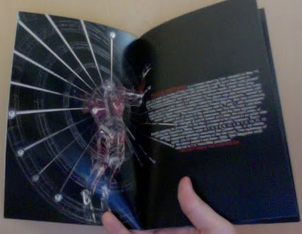
As a follow up to my previous post, I thought the best way to show my booklet would be physically. The next best thing is to just photograph it. On the off chance I don't get it back from my professor, I'd like this record of it for now because it's just so much cooler on paper than it was on screen. Even though that's what it is now in this entry. I should note that I'm extremely tired and should probably have waited 'til morning. And in the future I might refrain from blogging so late.
Addendum:
I've submitted the book, and received very positive feedback on the layouts, however having lacked the guidance offered had I been capable of attending those classes, I did have some typographic flaws I will fix up. Most notably I'll probably make the text colours more white. As you can see in the images some of them printed a little dark, plus I need more unity.
Sunday, May 8, 2011
Reprinted
So... Somebody in my semester beat me to the punch. As I had broken my ankle, I was granted an extension on my final Print class assignment, which was to create a 12 page booklet plus cover. I had initially chosen Trent Reznor, as you'll note by my previous entry, but last week, while volunteering for the Seneca College booth at FITC, I had the chance to look at a few examples of that assignment. One was a booklet about Nine Inch Nails. It was very well done, and I had no desire to compete, as we all all know the difference between saying Nine Inch Nails and Trent Reznor is semantic.
Tool is my other great love in music, so I chose to go with them. But, I wanted to step out even once more. Anyone choosing a band or musician would have some sort of bio perhaps, the band's origins and a description of their work. So I did not chronicle the band's history, I decided to focus on a single album. Anyone who knows me, knows I chose Lateralus.

Initially, I wanted to have one page per song, but then I would be robbing some songs of deserved spreads, due to the page limitation (I'm sure my teacher would accept more, but I need to get this in. I might create one for myself on my own time). Also, one of the main focuses on the assignment was spreads. Furthermore, the content had to have a little more to it. Columns, for example.
My solution was to:
- List the tracks first and display the band
- Describe the concept of the album
- Describe the creation of the album
- Give lyrics and information for the three singles, "Schism", "Parabola" and "Lateralus"
- End with a "Reflection" summary (with the lyrics of that song)
I've decided to post my favourite of the spreads for this assignment, the "Creation" spread.
Copy is modified for the spread from http://en.wikipedia.org/wiki/Lateralus.
The image is from a Tool t-shirt called "Think Man"

Saturday, April 23, 2011
How Could I Forget...
I've uploaded my personal demo reel... Check it out at http://www.vimeo.com/22691902
Labels:
Demo Reel,
Infinitesima,
J Hopkins,
Jayson Hopkins,
Show Reel
Subscribe to:
Posts (Atom)