Thursday, January 26, 2012

Now In Colour: Rechromatic II


When looking for early photographic examples to colourize, I think John Herschel deserves a tip of the hat.


(I have no idea what colour John Herschel's eyes were)

Wednesday, January 25, 2012

Rechromatic


After viewing examples on smashingpicture.com that Bud had posted, I decided I had to try adding colour to black and white photos. I think the process can be complex when getting into highly detailed work (particularly in making hair appear natural), but for the moment, I've decided to make my firsts relatively simple. Although I must admit I'm particularly happy with this one, in part because of the framing.


Wednesday, December 14, 2011

Fun While Learning ASL

My internship in college was spent preparing video assets to be used in an iPhone application that will be used to teach parents and toddlers sign language. It had a slightly different look before, but since the final thoughts on editing and style have been laid out, I have an example I can show. The project is still underway, so only one example for now...

Wednesday, October 19, 2011

Infinitesimal Rebranding Series


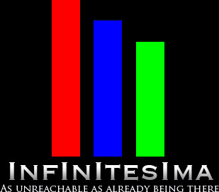
I originally branded infinitesima.net from the red, blue and green bars alone set on black. I'd become convinced the site felt too student, rather than a professional portfolio, in part because of the font and the emphasized I's in the logo (I wish I'd been more typographically aware), so months ago, I previewed a new black on white logo, which would have required a complete rebrand of the site.


Although that logo was well received, a couple people said my original branding was clever, and should be left, citing my Creations page headers which featured the original logo stylized to reference the title. So I left the branding concept and modified the text, basing it on the newer logo.


...although the text looked nicer (and kind of cool with the infinity in negative), I felt the bars looked out of place. A friend commented on the RGB making it look a bit amateur. After that, the more I looked at it the more out of place they felt. Rather than go back to the branding question, I kept the bars, but made them all grey. At this point I have an all grey on black concept, a little achromatic for a minimalist design site. Then inspiration. I think I've found my answer:


Tuesday, September 27, 2011

Lightsabers

This was an early assignment from my motions graphics class adding the lightsaber effect to a scene from Phantom Menace. I purposely avoided giving them the correct colours just so it was evident I didn't just take the final result right from the completed film.

Entering The Second Dimension

This was something I had done in After Effects with a jpg. Without such modern techniques, one would have to be mad to think you could truck a camera into a still image. Well, I'm about to walk with you into an asylum of old. May you find the help you need, as I have.

The Image:

And The Result:

Why, yes. Yes I Am a Nerd.

...now don't tell me you didn't also think of this a long time ago. I just had to photoshop a Kim Cardassian pic...